
Overview
MidPay is a payment platform designed to help contractors and small business owners manage transactions with more clarity and confidence.
The project began as a mobile-first concept and later evolved into a web-based product as business needs and product direction shifted. As the sole designer, I worked closely with the founder and engineer to define the user experience, adapt to product changes, and design a system that prioritized trust, transparency, and ease of use.
Problem: Getting paid shouldn’t feel risky, but for many freelancers and small business owners, it does.
Late payments, unclear transaction status, and lack of protection create stress and mistrust between clients and contractors. During early research, we found that many users relied on informal tools or workarounds that offered little visibility or security.
MidPay started as an idea to fix that.
Goal: To create a payment experience that made users feel confident, protected, and in control.

My contribution
Product strategy, User research, Product design, Brand design
The team
1 × product designer
1 × engineer
1 x stakeholder
Tools
Figma, Zoom, Maze, Optimal Workshop, ChatGPT, G-suite
Adobe Illustrator
Skills
User research, Synthesizing Research, Information Architecture, Wireframing, Branding
Prototyping, User testing
Year
2024- Ongoing
The Challenge
When this project started, MidPay was envisioned as a mobile-first app for freelancers and small business owners.
But we quickly realized:
Users cared more about security and payment clarity than flashy features
Trust mattered more than speed
And different users had very different expectations around how money should move
As the sole designer, I had to:
Define the user experience from scratch
Translate product ideas into real flows
Balance business needs with user trust
Design for a product that was still evolving
Research & Discovery
To understand the problem space, I:
Conducted competitive research on payment and escrow platforms
Ran a survey with small business owners and freelancers
Interviewed participants to uncover their frustrations and needs

Key insights:
Users cared more about clarity than speed
Payment status was often hidden or confusing
Trust was the biggest factor in adopting a platform
Users wanted reassurance that their money was protected

These insights guided the early design direction and feature prioritization.
Defining the User
From research, I created a primary persona to guide decisions.
A freelance designer who values professionalism and reliability but struggles with:
Tracking payment status
Trusting clients to pay on time
Communicating payment expectations clearly
Alex’s goal was simple: Send a payment request and feel confident the money is protected.

Phase 1: Designing the Mobile App
The initial direction focused on a mobile-first experience, since freelancers often manage work on the go.
Key Design Goals:
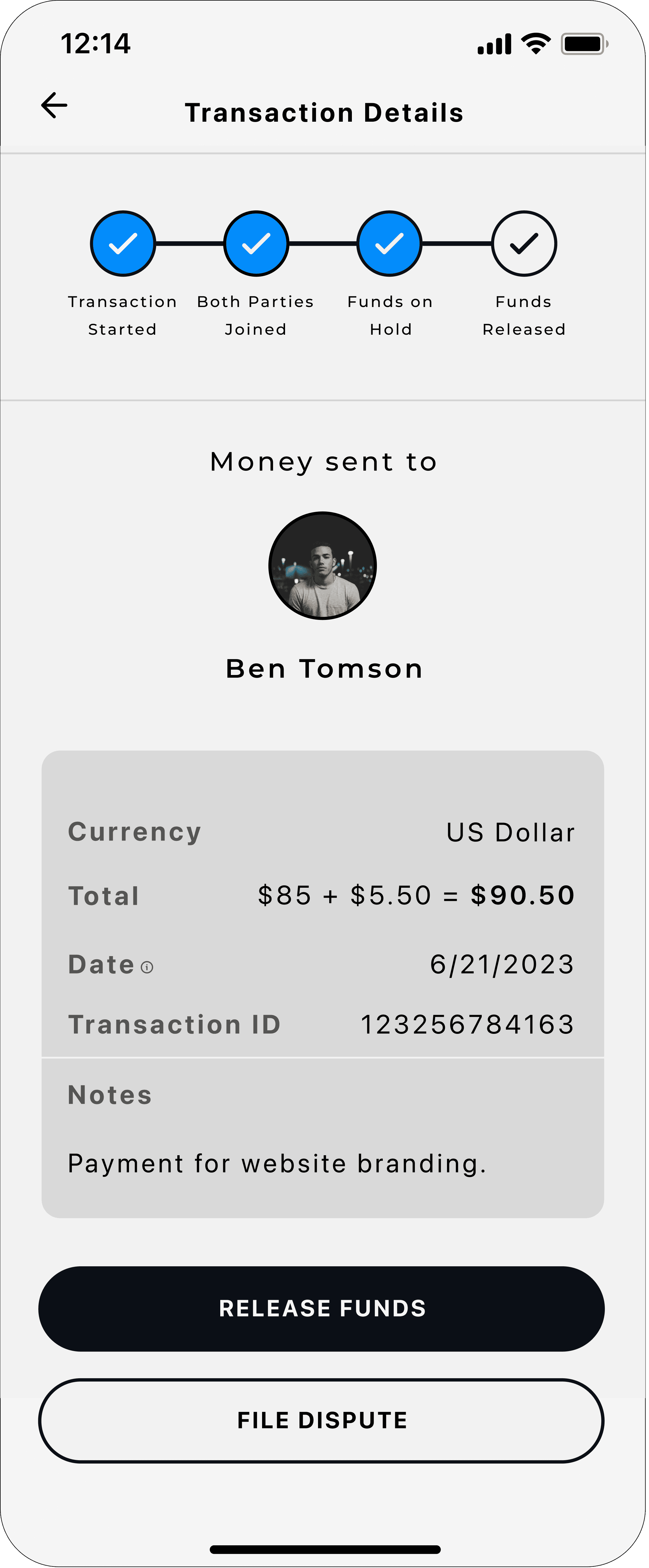
Send payment requests easily
Track transaction progress
Release funds securely
Reduce uncertainty at every step
Core Feature: Transaction Flow
The Pivot: Shifting to a Web Platform
MidPay’s direction changed when the founder decided to prioritize a web-based platform for contractors.
This decision was driven by:
Long-term business goals
The need to support more complex workflows
A scalable solution for multiple jobs and clients
Rather than seeing this as a setback, I adapted the design to align with this new strategy.
How the Design Evolved
The shift to web required a rethink of structure, hierarchy, and user experience.
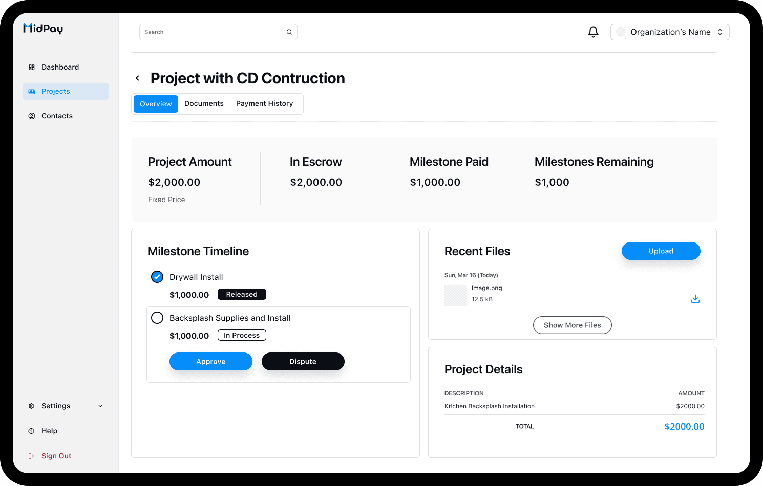
From Single Transactions → Dashboard-Focused Workflows
Mobile flows focused on one-off payments. Web needed to handle multiple projects and milestones.
Dashboard shows all active projects and payments at a glance
Milestone tracking visible in one place

Dashboard overview prioritizes clarity and control.
Complex Workflows Made Simple
Web platform supported advanced features:
Escrow protection
Milestone approvals
Transaction history and account management
Outcome & Learnings
This project taught me how to design within real product constraints.
Key takeaways:
Product direction can change, good design adapts
Business goals and UX must align
Clarity builds trust more than visual polish
Early-stage products require flexibility and communication
Most importantly, I learned how to translate shifting requirements into a clear, usable experience without losing sight of the user.
Final Reflection
Working on MidPay helped me grow as a product designer by pushing me to think beyond individual screens and focus on designing for trust and clarity. It taught me the importance of collaborating closely with stakeholders and adapting quickly to changing product directions. Above all, the project reinforced my belief that strong UX is about solving real problems, even when the solution evolves along the way.