
Overview
Problem: Metro decided to create a website to appeal to a wider audience. Yet, they found that they didn't acquire as many clients as expected.
Solution: Metro wants to develop a user-centric site that attracts additional clients seeking service quotes.
My Contribution
Researcher, Product Designer, Brand Designer
The Team
Solo Designer
Tools
Figma, Zoom, Maze, Optimal Workshop, ChatGPT, G-suite
Adobe Illustrator
Skills
User research, Synthesizing Research, Information Architecture, Wireframing, Branding
Prototyping, User testing
Year
2022
Discovery
User Interview

Main Persona
I crafted a user persona, Leonard, a married software engineer with two children, who is in the process of buying a new home and seeks assistance in finding the ideal contractor to build his dream house. This persona gave me an idea to the user's pain points and requirements.

Feature Map
To begin to focus on what features were important, I dedicated the time and created a map to show me what features the website could have. I had a meeting with the stakeholder to discuss this map. We came into agreement that this will be a good step to move forward.

Journey Mapping
Having the idea of possible tasks a user can take was important to make sure that design has a better user experience. I focused on my persona's journey.
The user journey depicted Leonard's experience on the website, emphasizing his decision-making moments as he transitioned from a Google search to Metro Home Improvement's site, where he explored flooring services and finished a form to contrast quotes from nearby contractors.

Task Flow: I designed a task flow to outline the steps my persona would follow to request an estimate for remodeling services.

Design
Exploring wireframes concepts
I began the wireframe creation process by utilizing my sketchpad and crafting various layouts for the crucial pages outlined in the user journeys, endeavoring to explore a range of design possibilities and ideas.


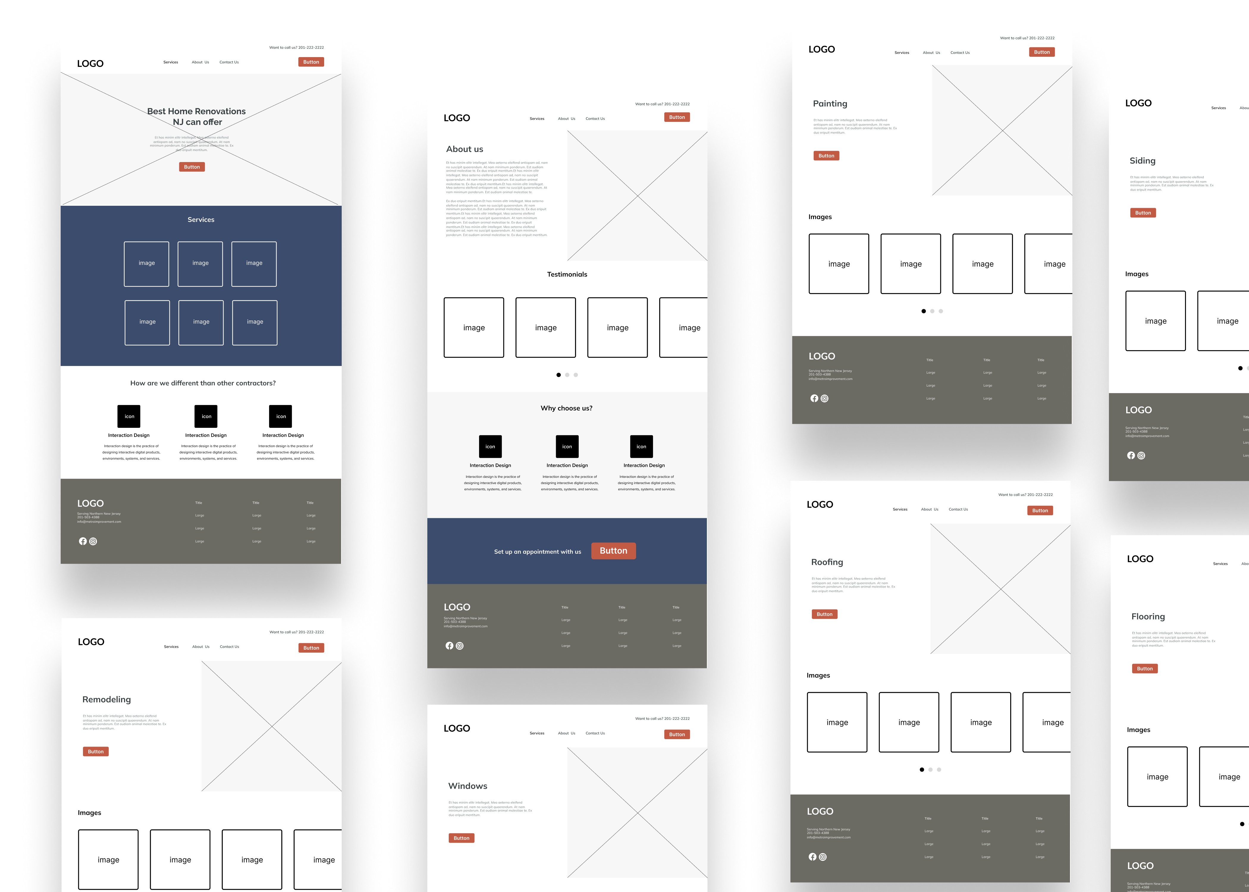
Mid-fidelity wireframes
After finalizing the sketches, I began to create a mid-fidelity wireframe using Figma. These wireframes ended up being my guide when starting to put together the first prototype.
Testing
Clicking “contact” and “get estimate” button were misleading.
In the usability testing phase, I engaged with five participants from my target audience via Zoom, with specific objectives, goals, and tasks in mind for this session
In general, website visitors enjoyed seamless browsing and successfully accomplished their goals. I collected valuable insights from them, integrating it into the ongoing enhancement process.
A frequent observation mentioned the uncertainty created by having both “contact” and “get estimate” buttons directing to the same page. This issue was carefully addressed in an iteration. For effective organization of the feedback, I created an affinity diagram to visually represent the successes, difficulties, and suggestions obtained from usability testing.

Iterations


Reflection
Considering the restricted timeframe I had for this project alongside my client, my priority was to develop the desktop version of the website. Moving forward, I will carry out another phase of usability testing to pinpoint possible problems users might encounter when engaging with the completed site. After resolving these issues, I'll proceed to create the mobile and tablet versions, guaranteeing my client a comprehensive responsive website.
Next Steps
Given the project timeline, I prioritized the desktop design. After launch, the client was satisfied with the outcome and opted not to proceed with mobile designs, as the website host already supported responsive behavior that would scale across devices.